Frutiger Aero: The Last Digital Utopia
Frutiger Aero represents the ghost of a utopia we abandoned. While it may never return in its original form, the rise of "Glassmorphism" in modern tech suggests that we still crave that depth, looking for our own reflection in the glossy glass of a forgotten future.
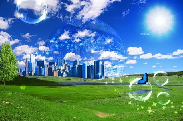
Frutiger Aero Example
There is a "lost future" shimmering in our collective memory—a world of translucent windows, impossible green fields, and the soothing sound of bubbling water. Before the arrival of today’s flat, sterile minimalism, the digital world spoke a different language: Frutiger Aero.
Between 2004 and 2013, this aesthetic wasn't just a design choice; it was a promise. It represented an era where technology felt organic, friendly, and inextricably linked to the natural world.
1. The Anatomy of a Name: Typography and Transparency
For nearly a decade, this aesthetic was omnipresent yet nameless. It wasn't until 2017 that researcher Sofi Xian and the Consumer Aesthetics Research Institute (CARI) coined the term "Frutiger Aero." The name bridges two foundational pillars:
- Frutiger: Refers to the humanist typeface family by Adrian Frutiger. While the specific font was rarely used in OS interfaces, its "humanist" philosophy—prioritizing warmth and accessibility over geometric coldness—influenced everything from Microsoft’s Segoe UI to Apple’s Myriad.
- Aero: A direct nod to Windows Aero, the interface introduced with Windows Vista that turned our screens into slabs of "glass" and light.
2. Visual Grammar: Glass, Water, and Optimism
Frutiger Aero was more than just "pretty"—it was pedagogical. As the masses transitioned to smartphones and Web 2.0, design had to be reassuring.
Skeuomorphism: Making the Digital Tangible
Through skeuomorphism, digital objects mimicked physical reality. A button wasn't just a flat circle; it was a glossy gel drop that looked "clickable." Apple, under Steve Jobs, took this to the extreme: the Notes app looked like a legal pad, and Game Center resembled a felt-topped casino table. It was a visual guide for a world learning to interact with touchscreens.
Hyper-Real Nature
While Cyberpunk imagined rain-slicked neon dystopias, Frutiger Aero dreamed of utopia. The palette was dominated by Lush Green and Atmospheric Blue. This was the era of "Green Marketing," where technology didn't destroy the planet—it enhanced it. We saw wind turbines on pristine hills and tropical fish swimming behind our monitors. It was the aesthetic of the "hybrid car" and the "eco-friendly detergent."
3. The Titans of "Techno-Zen"
The Aero era was defined by three major corporate visions:
- Microsoft (The Glass Symphony): Windows Vista and 7 made the desktop feel volumetric. Windows had depth, "aurora" light streaks colored our backgrounds, and "Flip 3D" allowed us to scroll through apps like physical cards.
- Nintendo (Glossy Accessibility): The Wii is the pinnacle of "Techno-Zen." Glossy white plastic, rounded menus, and the ambient compositions of Kazumi Totaka. Navigating the Wii Shop wasn't a transaction; it was a moment of digital relaxation.
- Apple (The Crystal Garden): iOS 1 through 6 turned the iPhone into a collection of digital jewels. Every icon shimmered as if under a spotlight, reflected on a glass dock.
4. 2013: The Great Tabula Rasa
The death of Frutiger Aero was sudden—an aesthetic "coup d'état" that occurred between 2012 and 2013. The reasons were both technical and ideological:
- Scalability: As screen sizes multiplied (from watches to 4K TVs), complex textures and drop shadows became a logistical nightmare. Flat Design (vector-based) was mathematically perfect and lightweight.
- The Rebellion of Jony Ive: In Apple, the departure of Scott Forstall (the champion of skeuomorphism) allowed Jony Ive to impose a minimalist vision. With iOS 7, the leather and glass vanished, replaced by neon gradients and abstract layers.
- Windows 8: Microsoft moved first with its Metro style, inspired by Swiss transit signage: nothing but typography and solid colored tiles.
5. Anemoia: Mourning a Future That Never Was
Today, Gen Z is rediscovering Frutiger Aero on TikTok and Reddit. This isn't just nostalgia; it is Anemoia—a longing for a time one never personally lived through (or only experienced as a toddler).
In a present dominated by "Corporate Memphis" (those flat, generic tech illustrations) and climate anxiety, Frutiger Aero represents a lost future. It reminds us of a moment when we truly believed technology would lead us to a glass-and-garden paradise. Looking at an old Windows 7 wallpaper today feels like looking at the ghost of a utopia we traded for efficiency.
Frutiger Aero will never return in its original 2009 form. However, its influence is resurfacing. Glassmorphism in Windows 11 and the translucent, lighting-reactive interfaces of the Apple Vision Pro suggest that we still crave depth. We still need the digital world to feel "touchable." Deep down, we are still looking for our own reflection in that glossy glass we once called the future.